All projects

Wellness E-commerce · Shopify Store

A Shopify store built around assisted selling

We conceived, designed, and developed from scratch the Online Store 2.0 theme for an independent Herbalife partner in the UK: visual identity, data-driven merchandising, a reload-free shopping experience, and personal consultation integrated into the funnel.

Look and Feel Better, Independent Herbalife Nutrition Partner (UK) · Wellness & Nutrition e-commerce · 2026

Look And Feel Better
Overview

Look and Feel Better is the official store of an independent Herbalife Nutrition partner in the UK. Its sales model isn't a simple catalog: it's assisted selling, where free personal advice via WhatsApp is the real differentiator from mainstream channels.

We built everything ourselves, from concept to launch: the visual identity, the design system, the 26 theme sections, the JavaScript logic, and every sales mechanic. No starter theme, no framework. Discount badges calculate themselves from prices, merchandising is managed through a tag taxonomy we designed, three-tier bundle programs have their own data structure and dedicated templates, the WhatsApp channel is integrated at every point in the funnel and configurable from the Theme Editor.

The work didn't stop at the theme: we digitized the client's entire catalog — 99 products — with structured descriptions, prices, tags, and metafields built on the data architecture we defined. We also prepared the store for real sales: Shopify account setup, payment method configuration, and shipping setup — everything needed to go live and start receiving orders. We also took care of the handover: an operational guide, a video tutorial outline, and branded PDF documentation, because the client manages the store independently. The entire project was completed in 14 days, followed by 7 days of revision with the client.

The product

What users actually see.

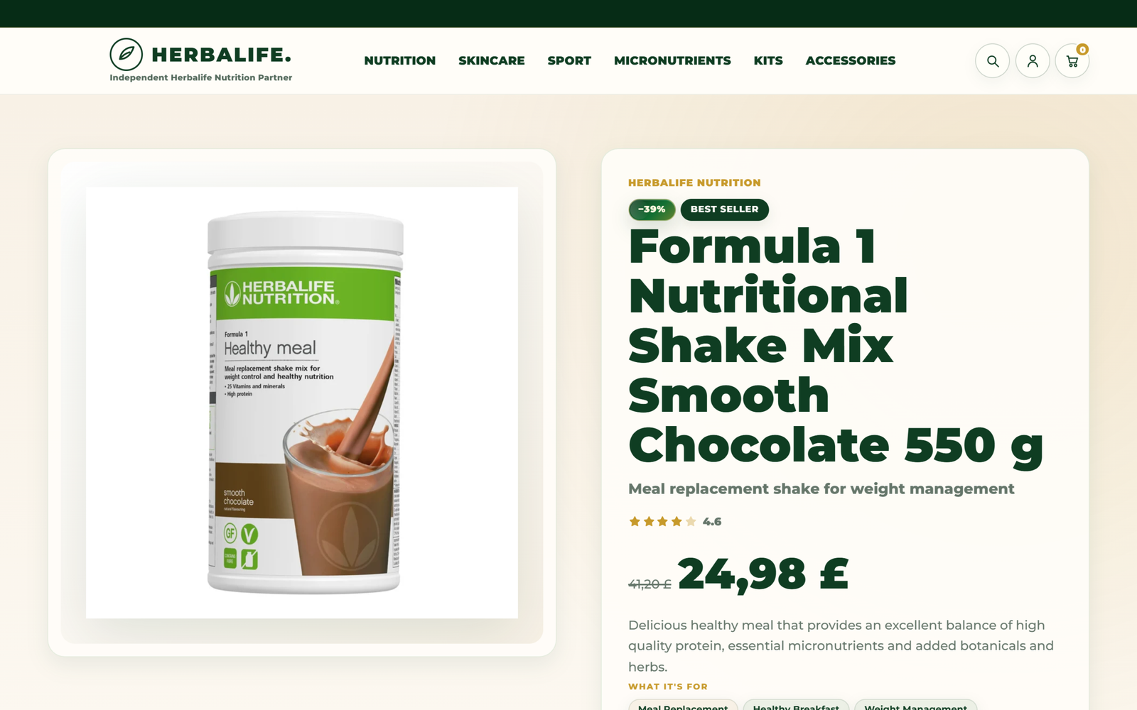
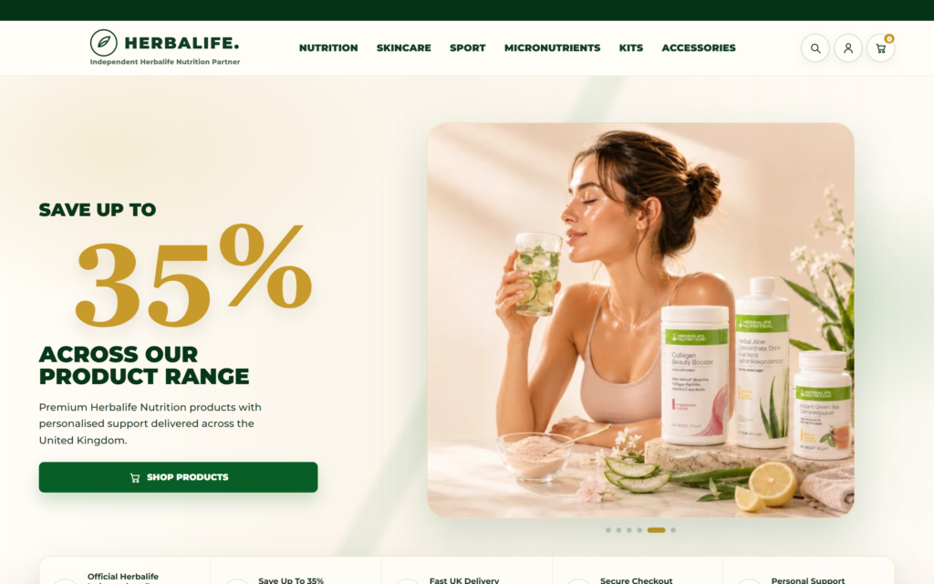
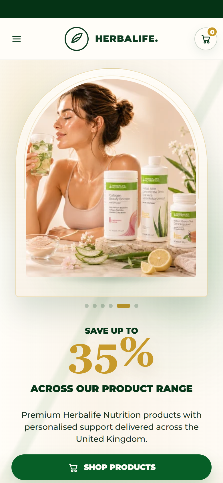
Visitors arriving from Instagram, Facebook, or WhatsApp — mostly on mobile — immediately see the offer: up to 35% off retail price and personal support. The hero showcases products in a slider inside the arch-shaped frame we designed as the brand's visual signature, with two clear paths: buy now or book a free consultation.

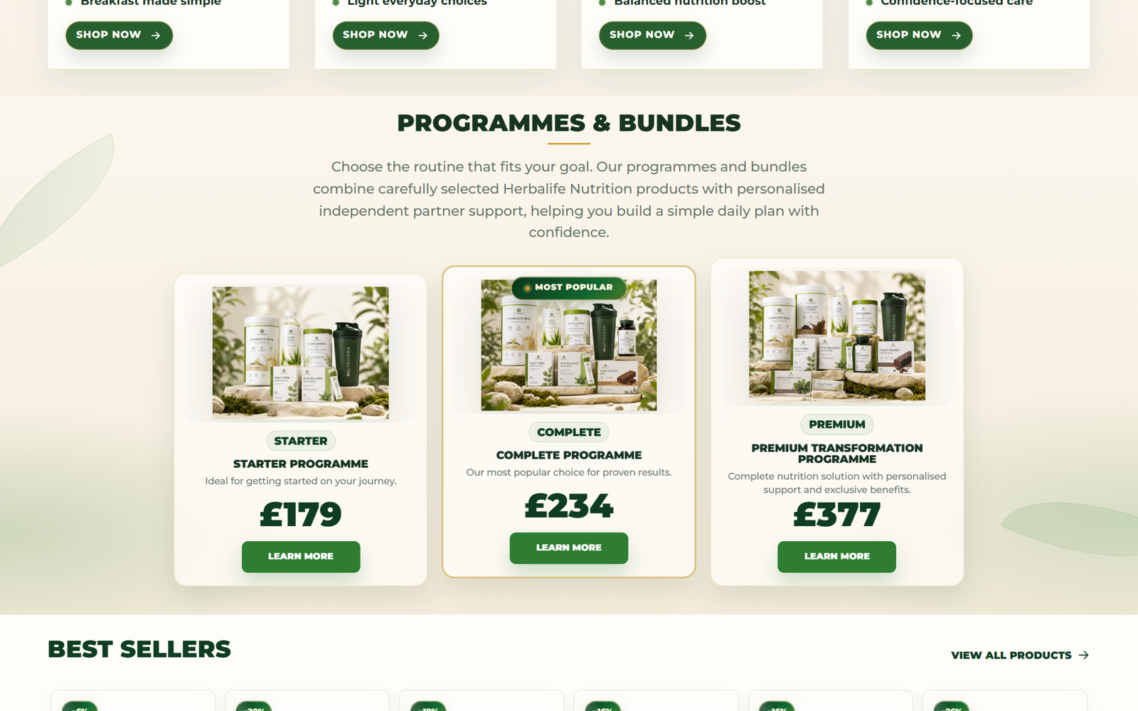
From there, the journey splits by goal (weight management, hydration, protein, skincare) or by commitment level: three guided programs — Starter, Complete, and Premium — combining products and partner support, with the bestseller highlighted.

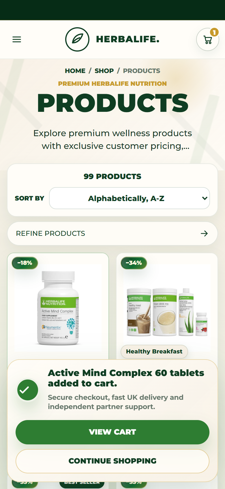
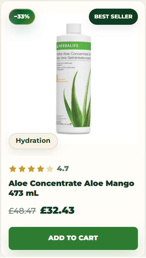
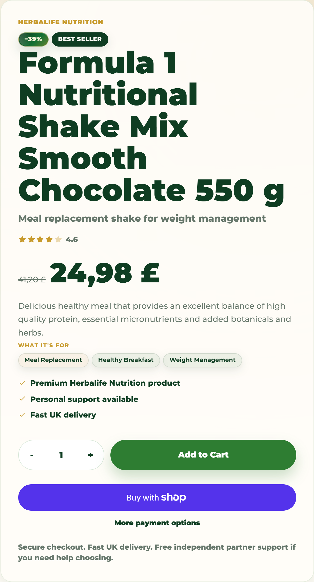
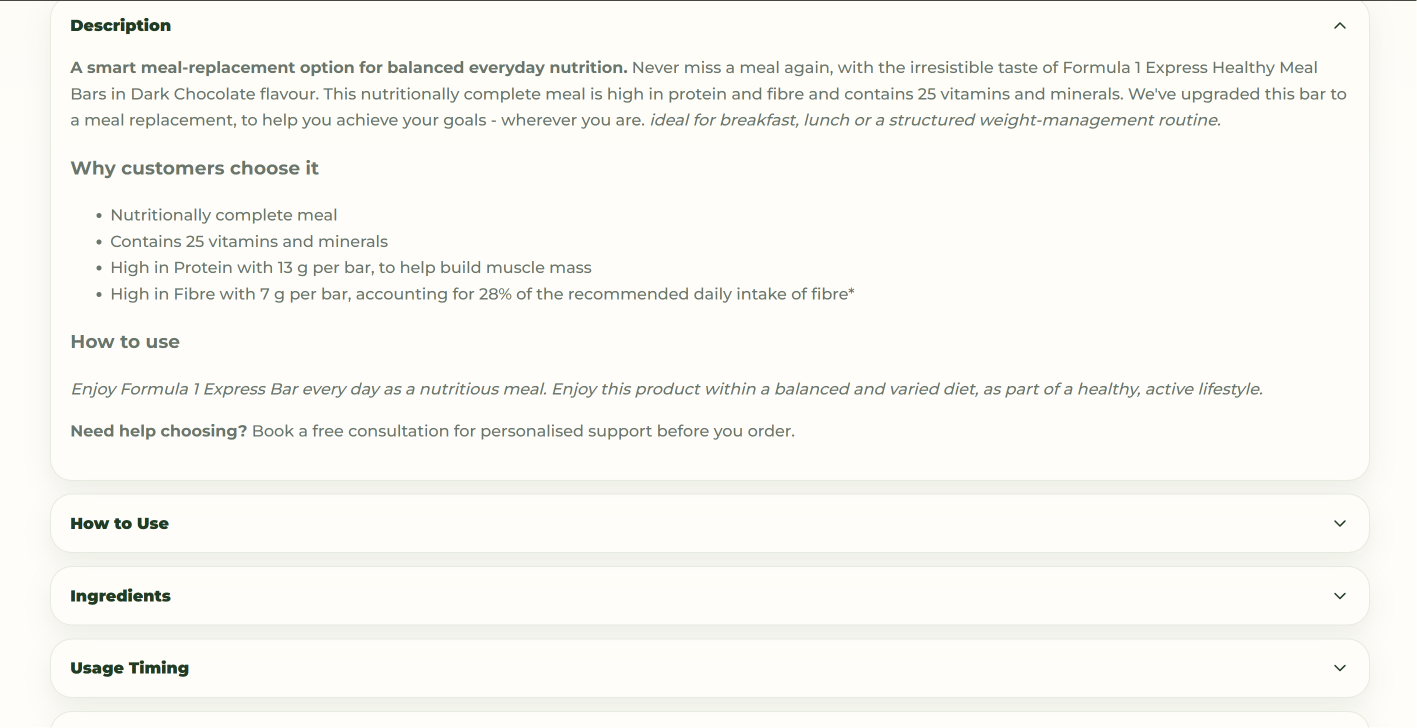
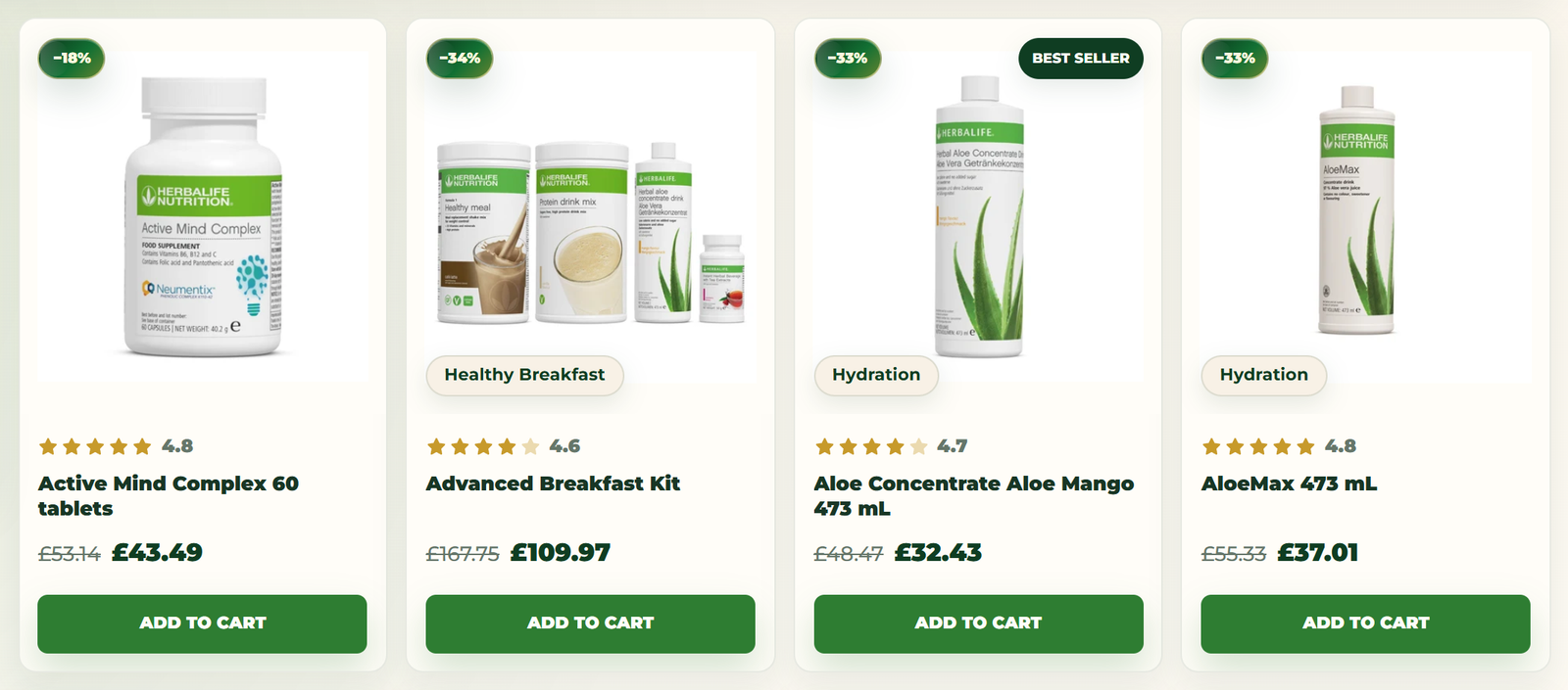
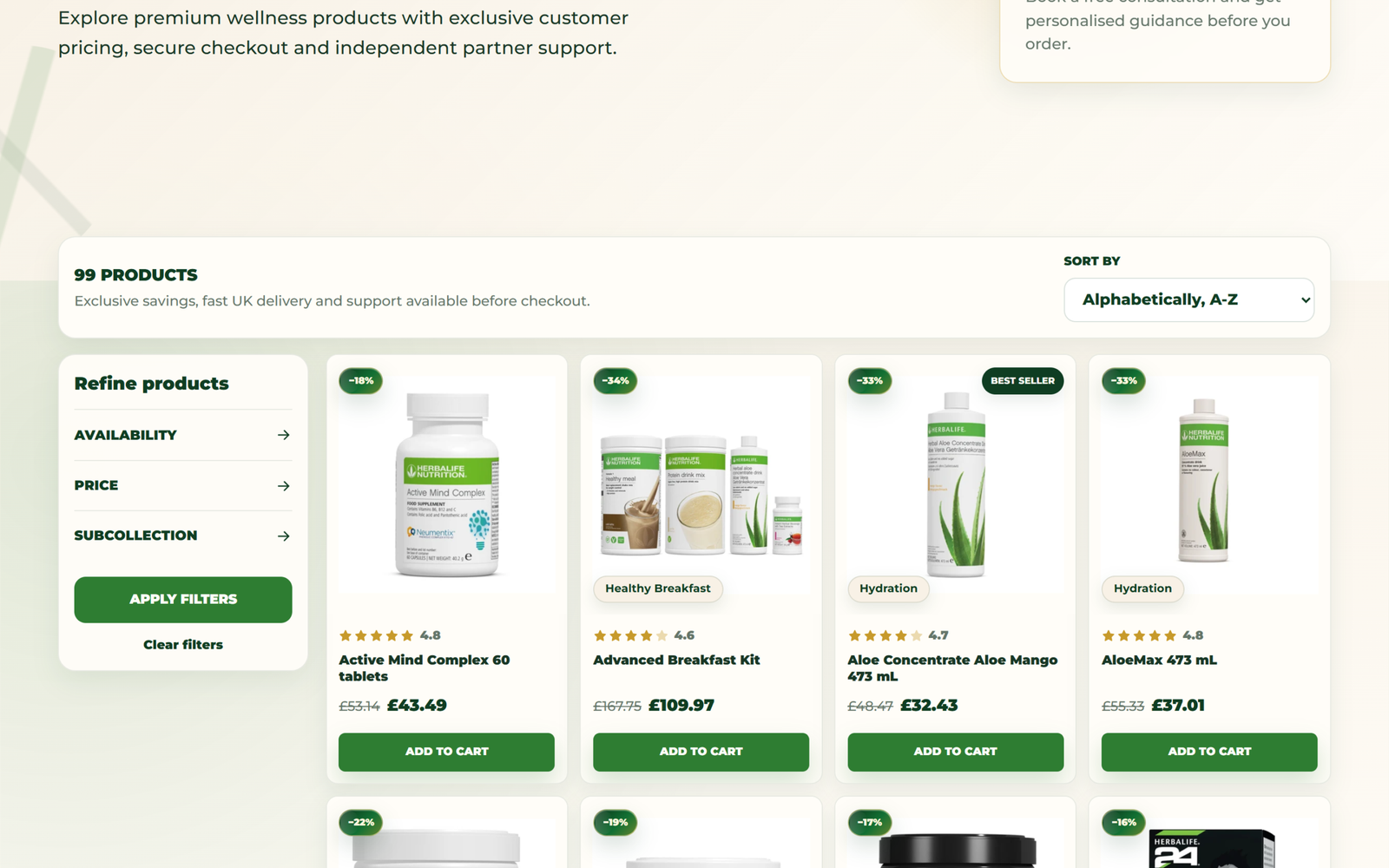
On product cards, every piece of information has a defined place: the real discount in the top left, status badges (Best Seller, Most Popular) on the right, and product function (Meal Replacement, Hydration) at the bottom. Items are added to the cart without leaving the page, with instant confirmation. Cart quantities update in real time. The product page answers questions in the right order: what it does, who it's for, how to use it. And if the customer is unsure, the partner's WhatsApp contact is just one tap away.

Look And Feel Better
Design & visual identity

Every visual choice has a reason.

The visual identity is entirely ours, from the first sketch to the last pixel — built around one simple question: what should a natural nutrition store look like when it's run by a real person, not a corporate chain?

Why green

Green is the natural choice for a brand living in the Herbalife and wellness space: it communicates nature, health, and freshness, and aligns with the sector's visual language without borrowing proprietary corporate assets. We use two shades with distinct, well-defined roles. Deep dark green (#0F3D22) frames the site: header, footer, strong headings, and the announcement bar. It conveys authority and acts as a stable visual container. Natural green (#2E7D32) is the action color: primary CTAs, Add to Cart buttons, active links, and conversion icons. Within seconds of browsing, visitors internalize an implicit rule: where that green appears, something happens.
Why cream instead of white

Section backgrounds are warm cream (#F8F1E6) and cards are ivory (#FFFDF8). We deliberately avoided pure white: it would have given the site a cold, clinical feel, while cream warms the page, makes it feel more premium and natural, and — most importantly — lets product photography breathe, since the packaging is predominantly white and green.

The botanical backgrounds

The plant elements aren't decorative filler — they're product context. In the hero we added CSS-drawn botanical decorations (laf-hero__botanical) that soften the background behind the product image. Category and program photography follows a clear direction we defined in the operational guide: aloe, leaves, natural stones, warm light, cream background. The result is visible in the Shop by Goal cards and program cards, where products are set among plants and natural materials. This positions the products as part of a wellness routine, not boxes on a shelf.

Gold accents: where and why

Gold (#C79A2B) is the color of value — which is exactly why we use it sparingly. Overuse would strip it of meaning. We placed it only where it needs to say "this matters":

  • the "35%" in the hero, the most important number in the commercial promise;
  • the circular premium badge in the hero ("Exclusive Customer Pricing");
  • the "Most Popular" badge on the center program card, rendered with a gold gradient;
  • eyebrows — the small labels above section titles ("MEET", "FIND YOUR WELLNESS PRODUCTS");
  • the short underline beneath section titles ("PROGRAMMES & BUNDLES");
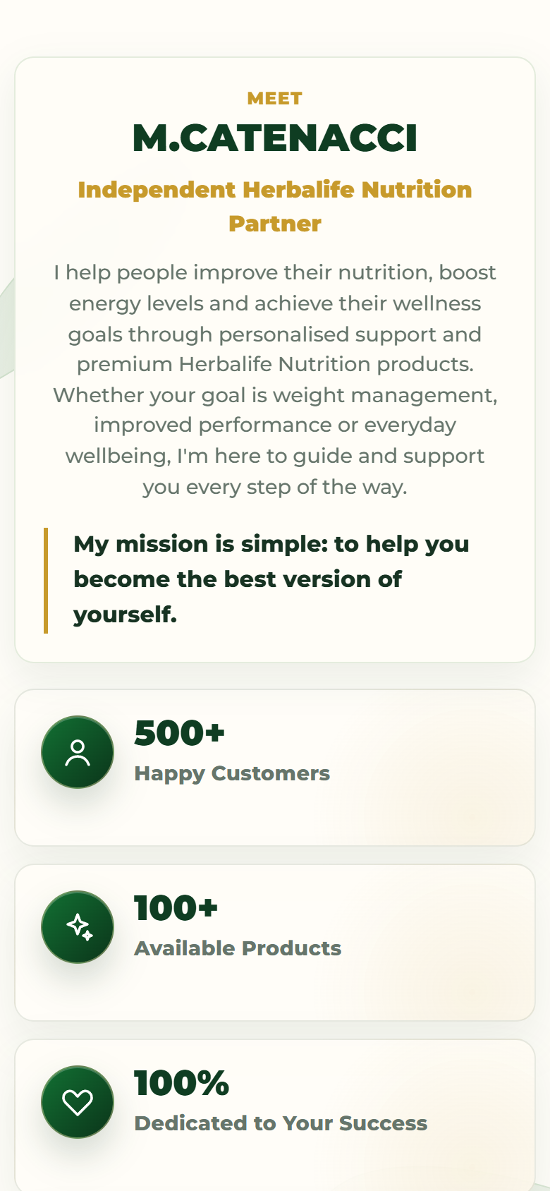
  • the left border of the partner quote in the "Meet" section;
  • the border on secondary CTAs, to distinguish them from primary green ones without demoting them;
  • the active dot on the hero slider and focus states.

The logic is hierarchical: green drives action, cream lets the page breathe, gold signals value. Three colors, three jobs, no overlap.

Typography and shapes

We chose a modern, highly legible sans-serif with bold, compact headings and a fluid scale that works well on mobile. No decorative serifs — they would have undermined the clarity and credibility that a wellness brand depends on, where readability equals trust. Shapes are soft throughout, with generous border radii on cards and panels and subtle green shadows, up to the arch frame of the hero — the most recognizable design element and the brand's recurring visual motif.

The entire palette is implemented as design tokens (CSS custom properties tied to theme settings), making it documented, consistent across every component, and editable from the Theme Editor without touching code.

Look And Feel Better
Key capabilities

What it can do, and why it matters.

Badges that never lie

The discount shown on every product is calculated in real time by comparing the full price against the current price — it can never fall out of sync with checkout. Editorial badges derive from a tag taxonomy we designed and documented, keeping merchandising across 99 products consistent and manageable without a developer.

Uninterrupted shopping

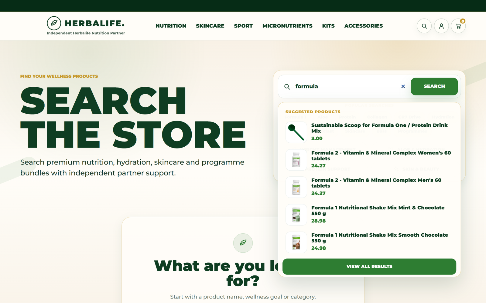
Quick-add from product cards with instant confirmation, a live cart counter, quantity updates without page reloads, and predictive search with live suggestions — all written by us in vanilla JavaScript on top of Shopify's native APIs, with no third-party apps.

Programs, not just products

Three guided journeys with pricing, included products, and partner consultation, backed by dedicated data fields and their own page template. The theme sells the partner's way of working, not just the catalog.

Consultation always within reach

The theme integrates the WhatsApp channel at every point in the funnel: a global floating button, a hero CTA, a dedicated partner section, and a per-product customizable message — all activatable and configurable from the Theme Editor, no code required.

End-to-end catalog digitization

We digitized the client's entire assortment — 99 products — with descriptions, images, prices with compare-at prices, collections, tags, and metafields. This data work is what makes automatic badges, filters, and programs function across the full catalog.

A storefront the client can manage

The hero slider accepts up to ten images with per-slide position and zoom controls directly in the Theme Editor — the client frames each shot without any image editing tools.

Inside the engineering

The interesting problems, and how we solved them.

01

A badge system designed to never get it wrong

ChallengeOn a catalog running continuous promotions, manually managed discount badges inevitably end up contradicting the actual prices.

SolutionDiscounts are never operator-entered content: a component calculates them by comparing variant prices. Editorial badges derive from prefixed tags (status:, goal:, role:, and others), all orchestrated by a single component with centralized labels and a two-badge-per-card limit.

Shopify Liquid tag taxonomy snippet architecture.
02

Interactive commerce without libraries

ChallengeDelivering quick add, a live cart, and predictive search — features many stores rely on paid apps for — while keeping the theme lightweight.

SolutionA single JavaScript file of roughly 900 lines, with no dependencies, communicates directly with Shopify's AJAX APIs: add-to-cart with a confirmation toast, line-by-line state sync with debounce and error recovery, and search suggestions with product previews.

Vanilla JS Shopify AJAX API (cart/add.js cart/change.js search/suggest.json).
03

Theme licensing within Liquid's constraints

ChallengeA Shopify theme is a file package that can easily be copied to other stores, and Liquid offers no backend to support a license check.

SolutionThe layout verifies the store's domain against a whitelist at runtime. If unlicensed, the theme displays a block page and marks pages as noindex. A real commercial control, achieved using only the platform's native primitives.

Liquid (shop.permanent_domain request.host).
04

Art direction from the Theme Editor

ChallengeProduct photos aren't shot for an arch-shaped frame — every image needs a different crop.

SolutionEach slide exposes horizontal position, vertical position, and zoom controls that the Theme Editor translates into per-slide CSS custom properties. The client composes the storefront without any photo editing.

Liquid section schema CSS custom properties.
05

A mobile menu that's actually accessible

ChallengeMobile drawer menus often break focus and scroll behavior, penalizing keyboard users and screen reader users.

SolutionFocus trap with inert management, scroll locking with position restoration, Escape key to close, and focus returned to the originating element.

Vanilla JS ARIA.
architecturehow it holds together

The system is a pure Shopify Online Store 2.0 theme written entirely by us: 26 composable Liquid sections via the Theme Editor, 16 reusable snippets, and JSON templates for every page type. Merchandising data lives in Shopify — prices, prefix-based tag taxonomy, and custom.* metafields — and the theme interprets it at runtime: prices generate discount badges, tags generate editorial badges, and metafields populate product and program content with ordered fallbacks.

The interactive layer is a single dependency-free JavaScript file that communicates with Shopify's native AJAX APIs for cart and search. The visual layer is governed by design tokens we defined (CSS custom properties tied to theme settings), making the entire palette editable from the Theme Editor. The layout also includes a domain-based license check that blocks the theme on unauthorized stores.

Shopify E-commerce Wellness Liquid Vanilla JS Conversion UX Design System D2C
Let's start

A project like this, for you too?

We start with a reading of your flow. No strings attached.